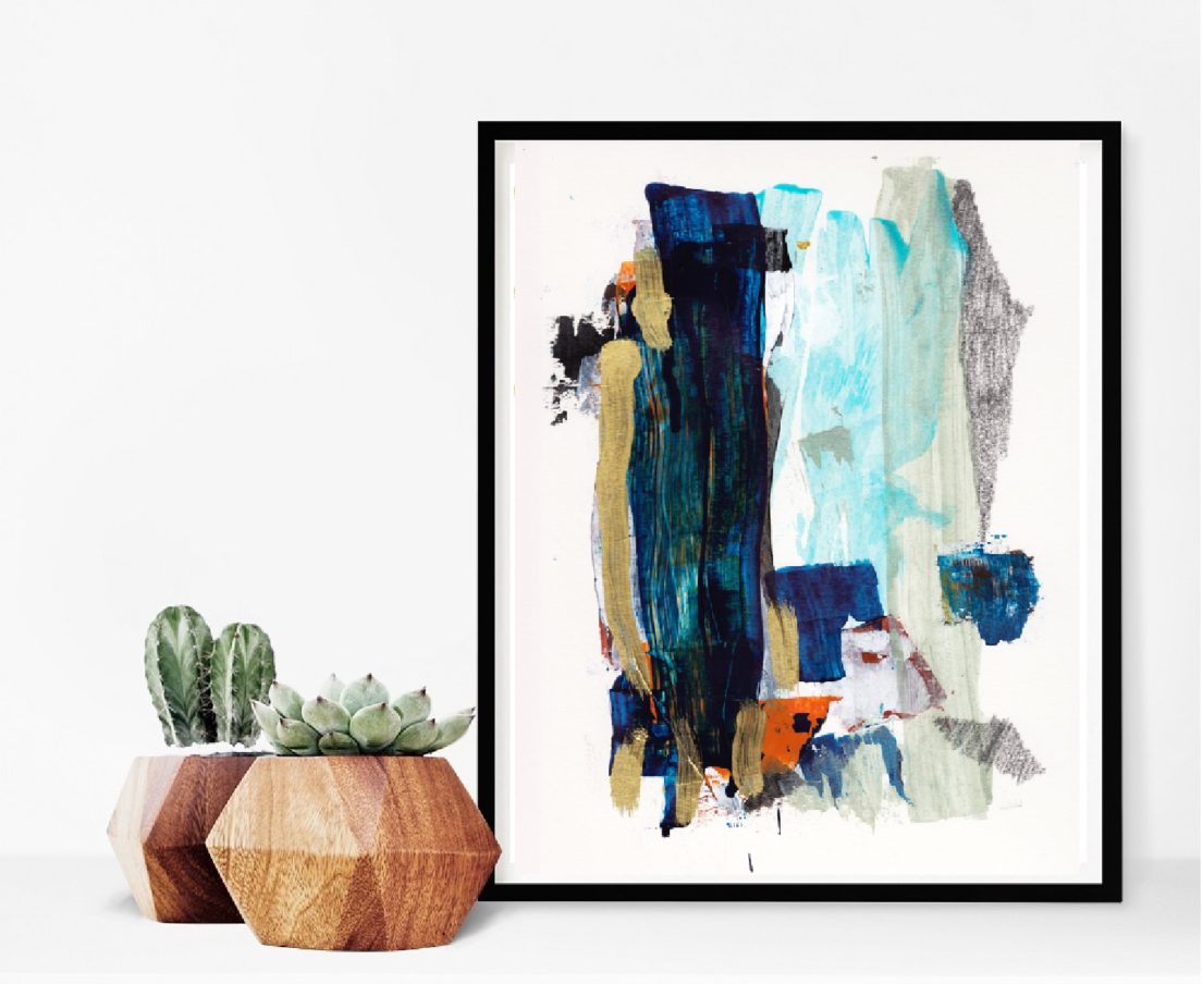
Negative space is the standard when you want people to focus on the art in front of them. It is why galleries have uncluttered white walls. It is why most museums keep exhibits airy and straight forward. White reflects light instead of absorbing it. And many white paints contain optical brightness to reflect even MORE light. At the same time, the white spaces falls away leaving the patron undistracted and able to appreciate the work.
There are multiple reasons white negative space is beneficial to your art display:

White equals negative space
We need that negative space giving rest to our senses and allowing our focus to tunnel in on the work in question. Without the contrast of negative space, the positive item in question fades into the world around it.
White offers a Clean back drop
I look out over the snowy field and any object on the prairie becomes obvious. On white, you can see what was not seen before. A fox slimming through the grass blends. On the white snow, she shines like a beacon.
White is a contrast literally every color
Your walls are the stage for that art. Any color aside from white will mute the display of that piece.

The last thing you want if you want art or any decor to pop, is a loud wall in a wild color. The wall becomes the focus instead of the other elements. Even gray doesn’t really work for displaying art. The one exception is if you want to display a large collection on one wall in a Maximalism styled gallery wall. In that case, none of the art will be the focus and the entire overall effect is the point. But when it comes to hanging modern art in a minimal setting, go for white. Go for simple. Go for the serenity of soothing white negative space to allow your favorite piece of art the room to breathe and be the focal point if the room.

 Favorite Art Supplies for Paintings