The orange of the berries of the Rowan Tree (Mountain Ash) look striking against the blue sky.
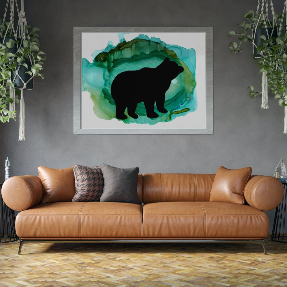
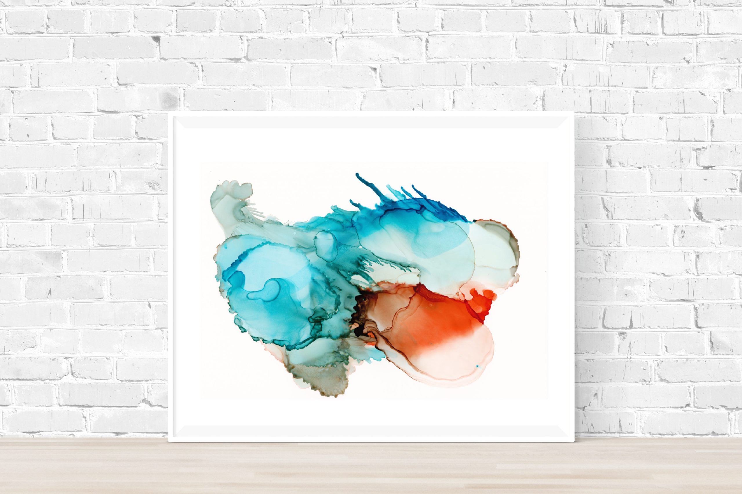
Complementary Colors: Blue and Orange
The visual party created by combining orange and blue, make it one of the most common purposeful color contrasts in artistic photography. It is a popular match in interior design, art, fashion, and much more. All for good reason.

In color theory, there are three traditional sets of complementary colors:
- Red and green
- Yellow and purple
- Orange and blue
These sets are all exact opposites on the color wheel and offer the most color contrast available to the human eye.
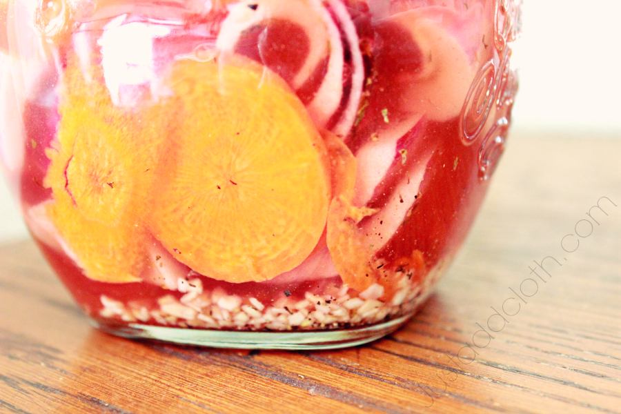
Basically, we humans find these combinations very attractive. So, it is no accident that we love how terracotta looks with turquoise. How orange berries of the Mountain Ash look against the azure sky. How autumn pumpkins look nestled next to mums potted in an aqua ceramic pot.

The dance between orange and blue is as contradicting as it is complimentary. They are hot and cold tones. Fire and ice. They are also both colors of the sky and the water’s reflection of that sky depending on the weather and time of day. They are probably the colors we encounter most in our lives in varying shades. The cerulean sky, pooling seas, clay and earth, sunrise, sunset, falling leaves, ripening fruit, high noon……
A bright robin’s egg blue even looks great against that orange-y oak trim all through out your dated, but comfortable Midwest home. (In a world of Pinterest and Instagram, isn’t everything dated by the we’ve heard of it??)
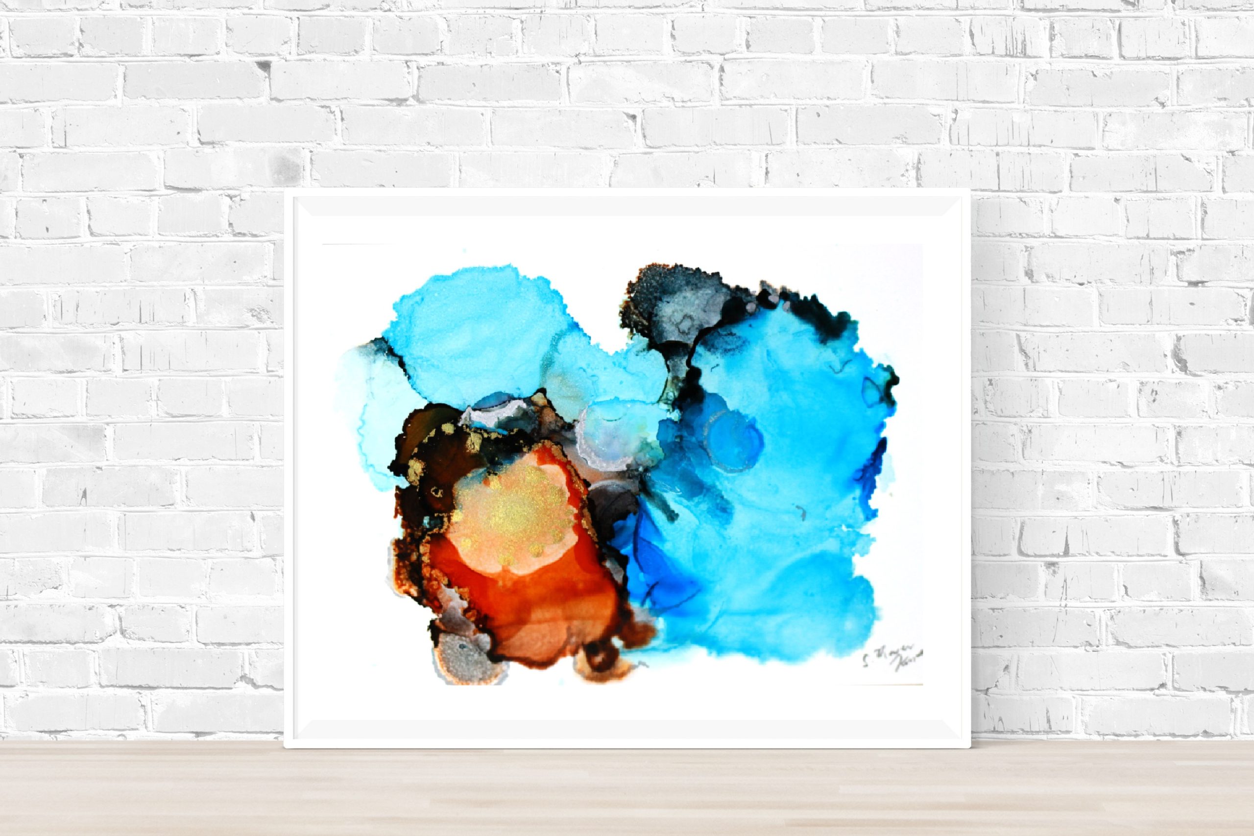
As a lover of blue, I often scoff at warm colors, but adding a few oranges and browns is the best way to really show off all that blue. Otherwise it is likely to get lost in a monochromatic sea.

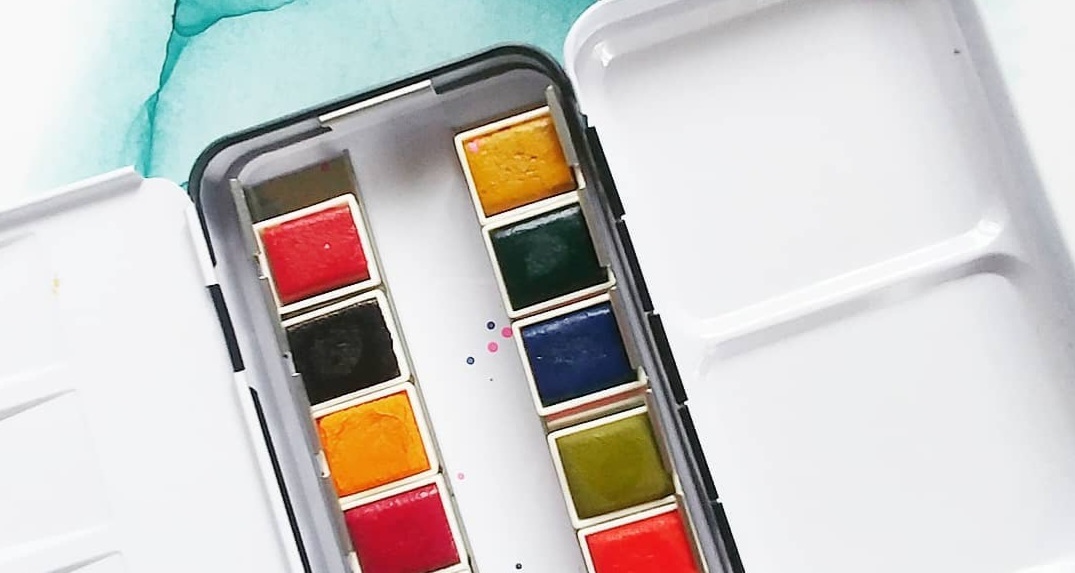 Favorite Art Supplies for Paintings